Visual identity design to support charity fundraising
Client: St Catherines Hospice
Sector: Charity
Services: Branding, Visual identity
Visual identity design to support charity fundraising
Client: St Catherines Hospice
Sector: Charity
Services: Branding, Visual identity
The Challenge
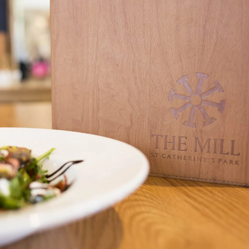
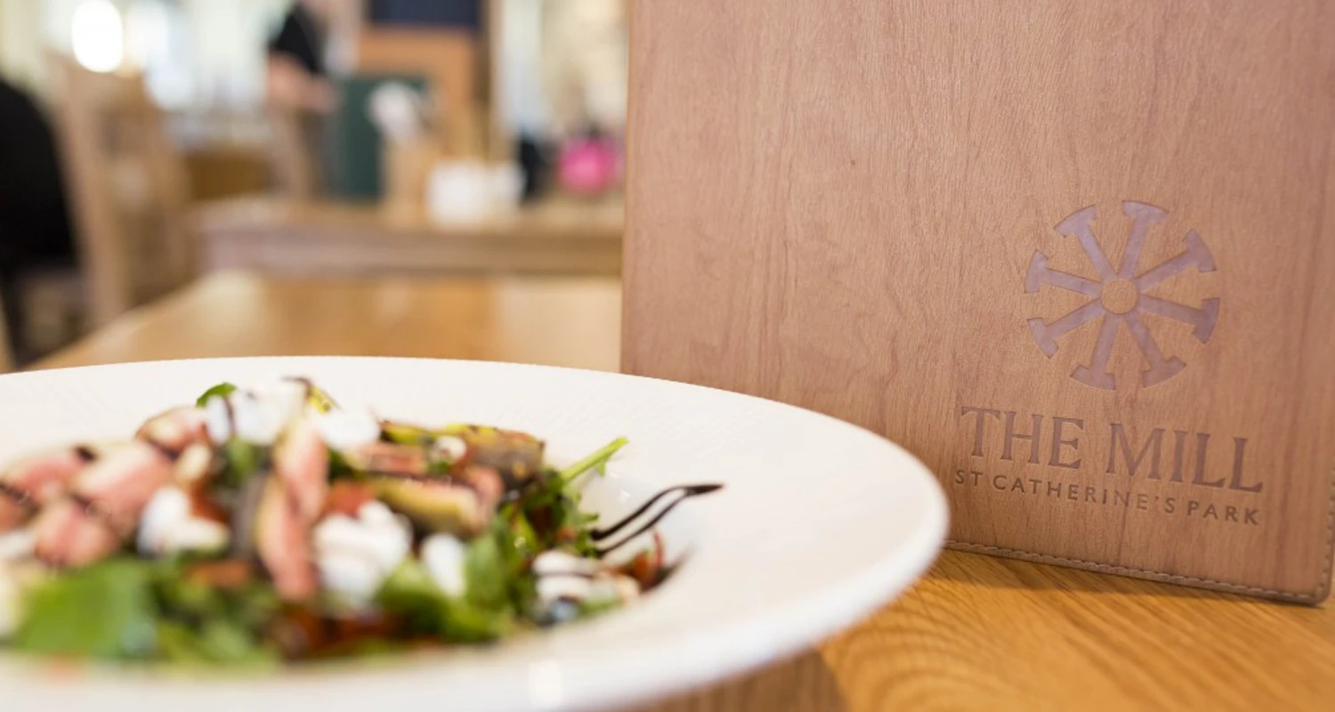
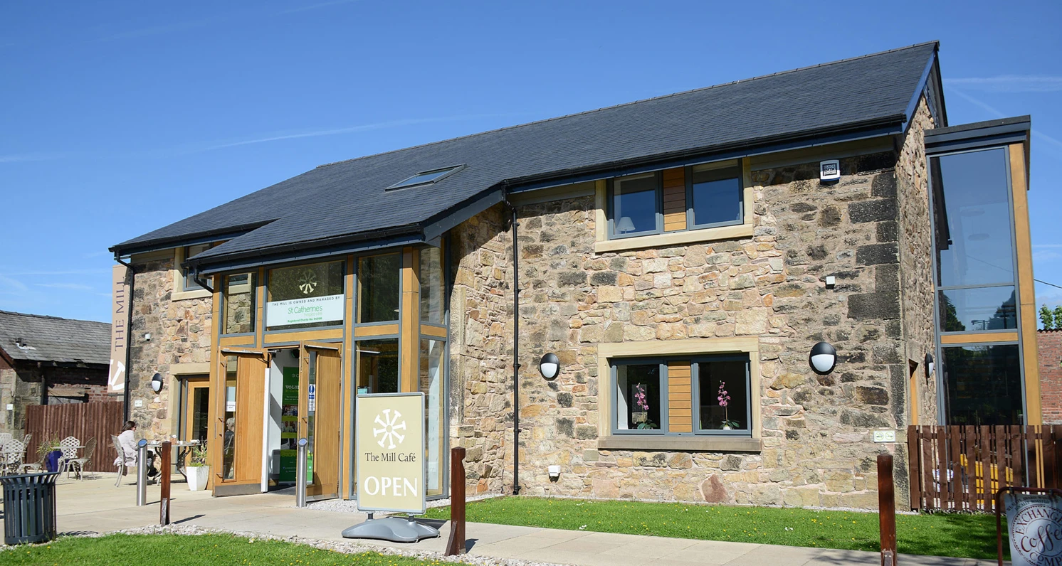
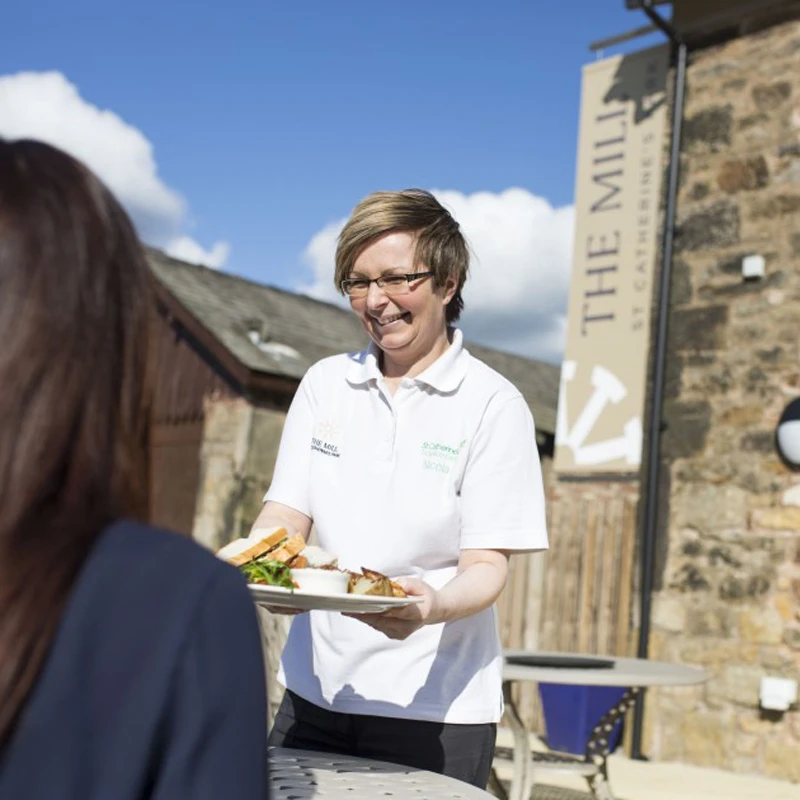
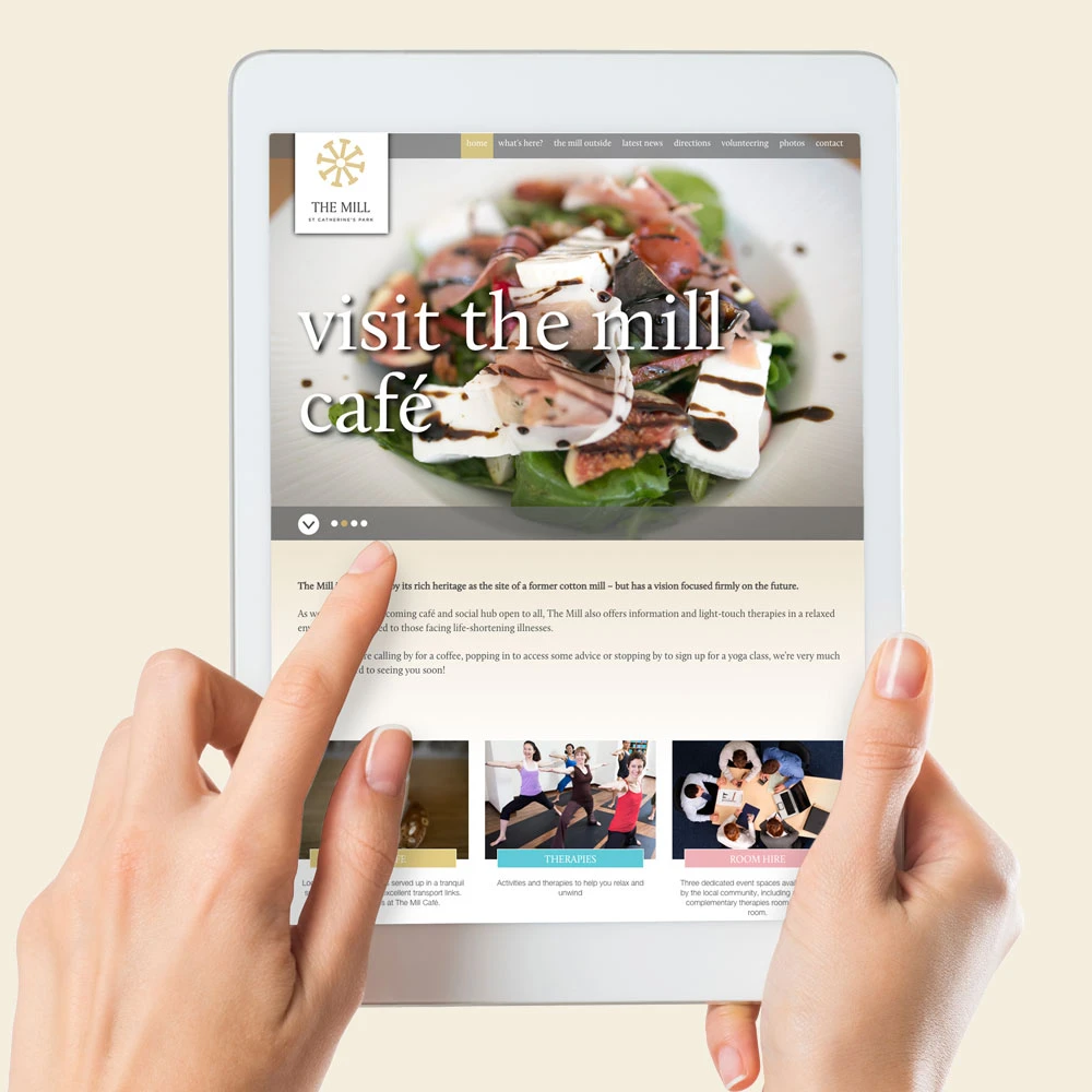
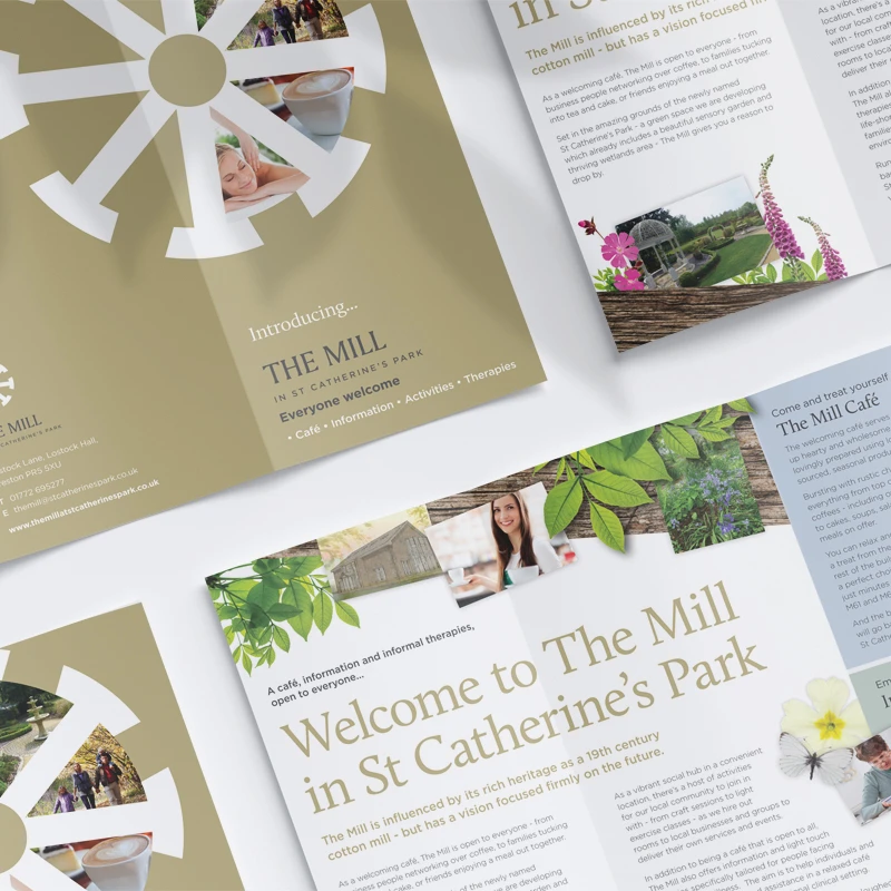
St Catherine’s Hospice set out to transform its grounds by opening them to the public and converting a mill into a café, information and therapy centre. This ambitious, community-focused vision required the development of a charity brand that brought together their purpose — to become a central hub for the community.
The approach
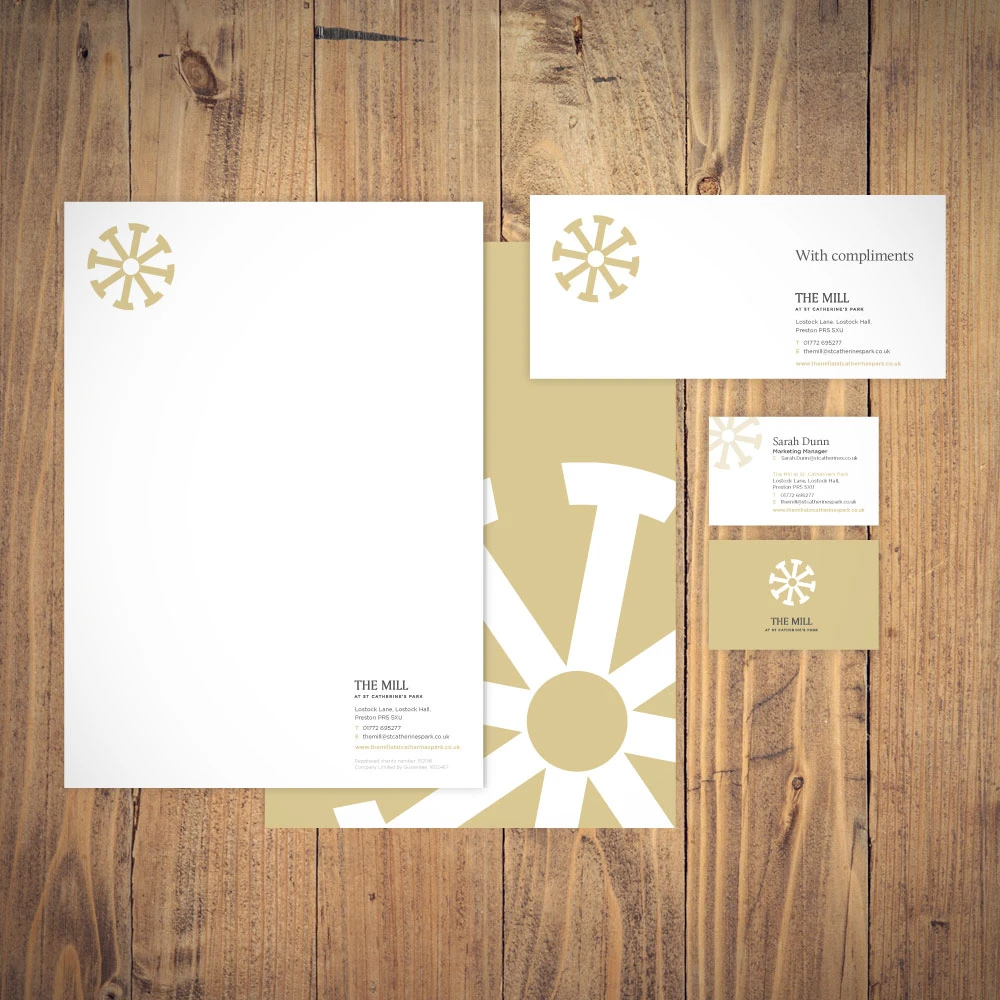
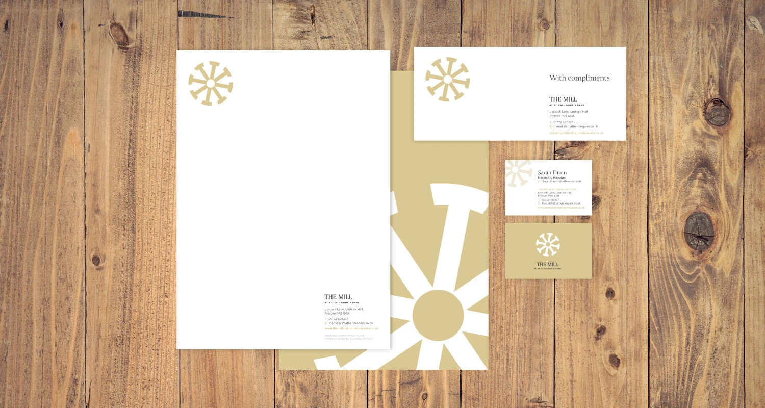
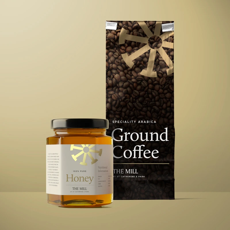
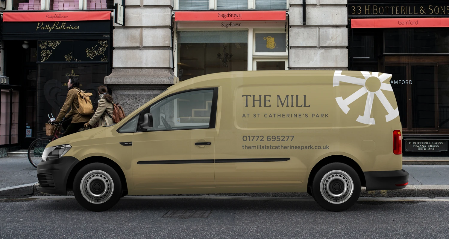
I developed a logo which resembles a mill wheel but carries a more meaningful message. The arrows point inwards with the centre circle representing ‘The Mill’. Instantly recognisable, it creates a strong identity with sophistication and style.
The Outcome
The new identity establishes St Catherine’s Hospice as a clear and recognisable community hub. It supports consistent communications across the site, helping to increase awareness, encourage engagement and drive fundraising.
The approach
I developed a logo which resembles a mill wheel but carries a more meaningful message. The arrows point inwards with the centre circle representing ‘The Mill’. Instantly recognisable, it creates a strong identity with sophistication and style.
All work was created whilst employed by Cube Creative.
Get in touch
If you’re working on a campaign, refreshing your brand, or looking for communications design support, I’d love to hear from you. Get in touch to start a conversation about creating design that informs, inspires and drives change.