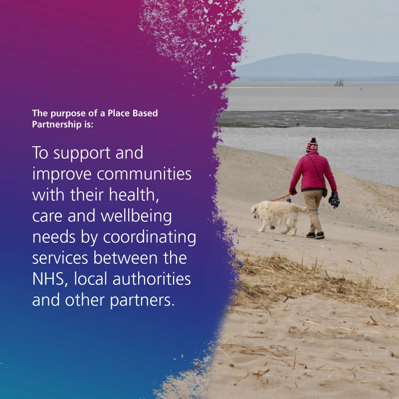
Integrated Pare Partnerships (ICP) are new partnerships between the organisations that meet health and care needs across a specific area. These partnerships coordinate services which improves population health and reduces inequalities. Lancashire and South Cumbria required new identities for each of the four regions which would strike the right balance between brand uniformity and distinguished individuality.
The approach
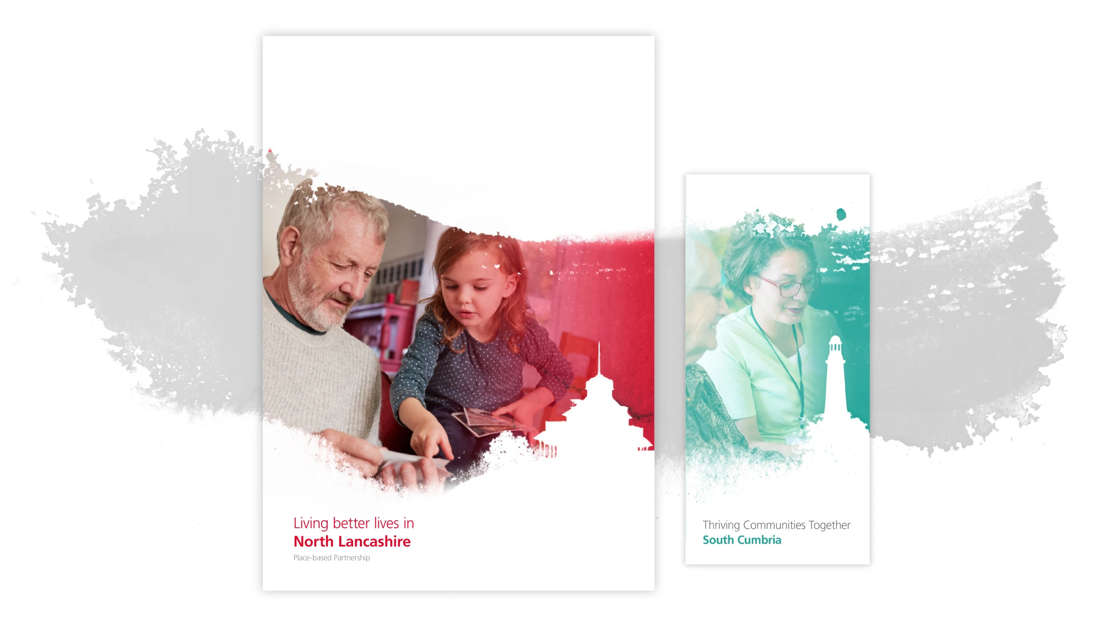
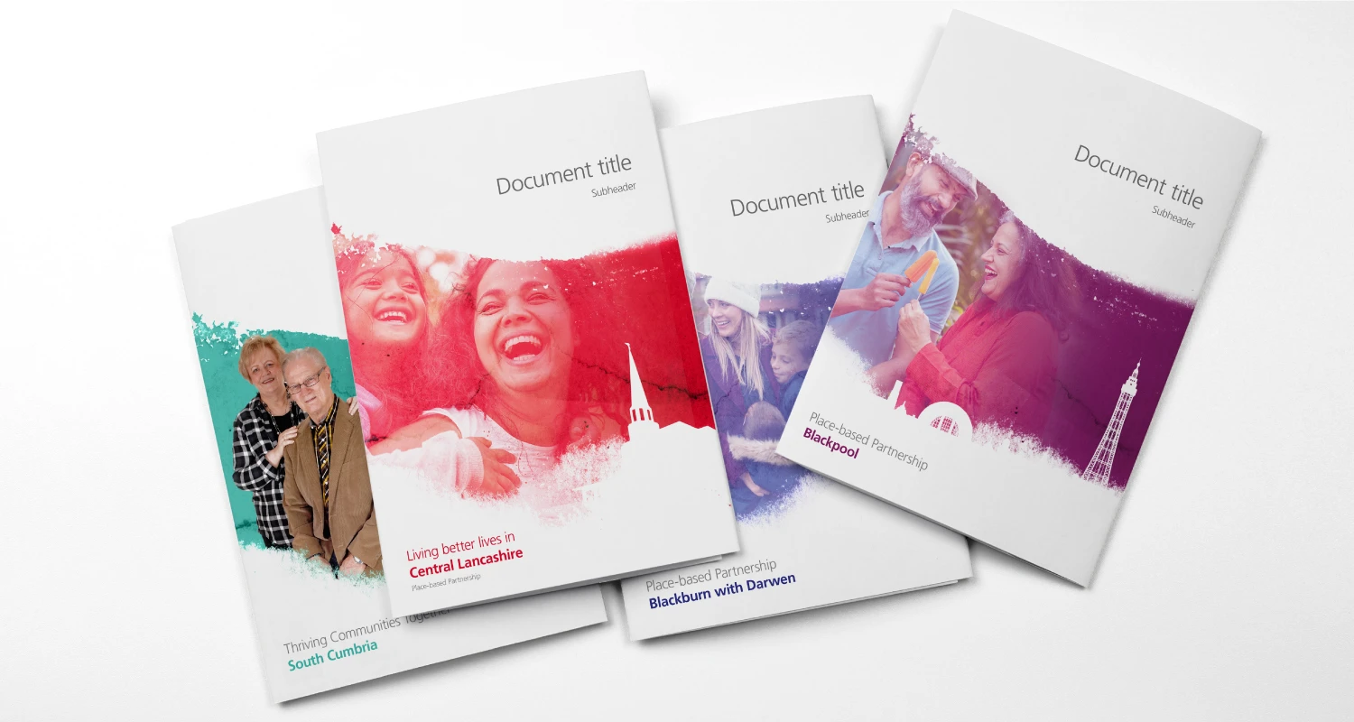
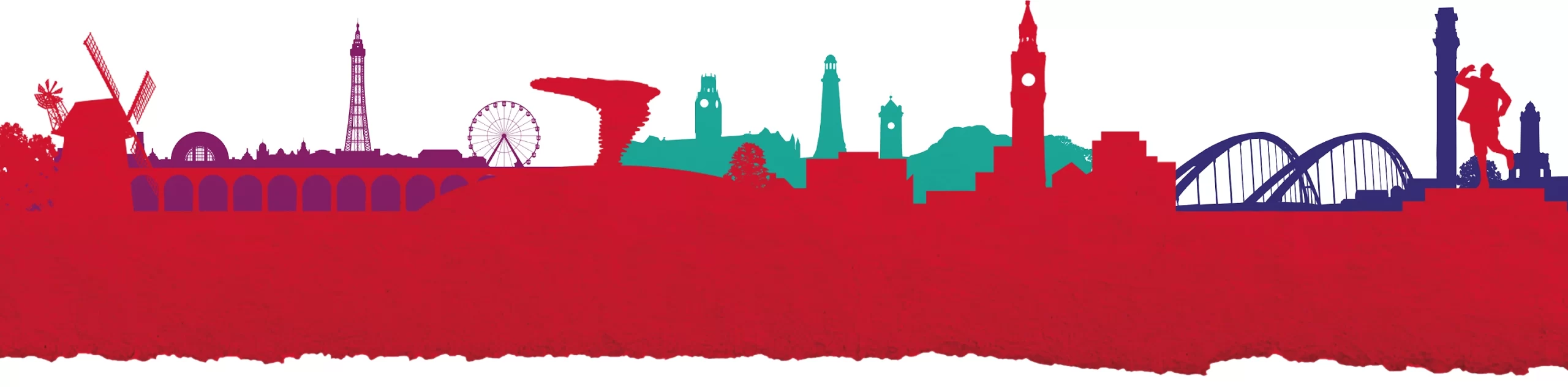
For this challenging brief we conducted brand workshops with representatives of each area and discussed the possibilities of a ‘common thread’ to the visual identity. One approach, which was widely favoured by the communications teams, was to use regional specific landmarks as support graphics for the identity. These silhouetted landmarks would then be used as footers on Microsoft templates and on printed marketing collateral.
But these simple landmarks didn’t reflect the core audience of the brand, it’s people. To do this I used a brushstroke graphic which represented the spirit, freedom and energy of the Lancashire and South Cumbria people, and together with localised photos, created a unique and memorable brand.
If you’re working on a campaign, refreshing your brand, or looking for communications design support, I’d love to hear from you. Get in touch to start a conversation about creating design that informs, inspires and drives change.