Creating a simpler and accessible website for NHS Lancashire
Visual identity // UX and UI design
The Challenge
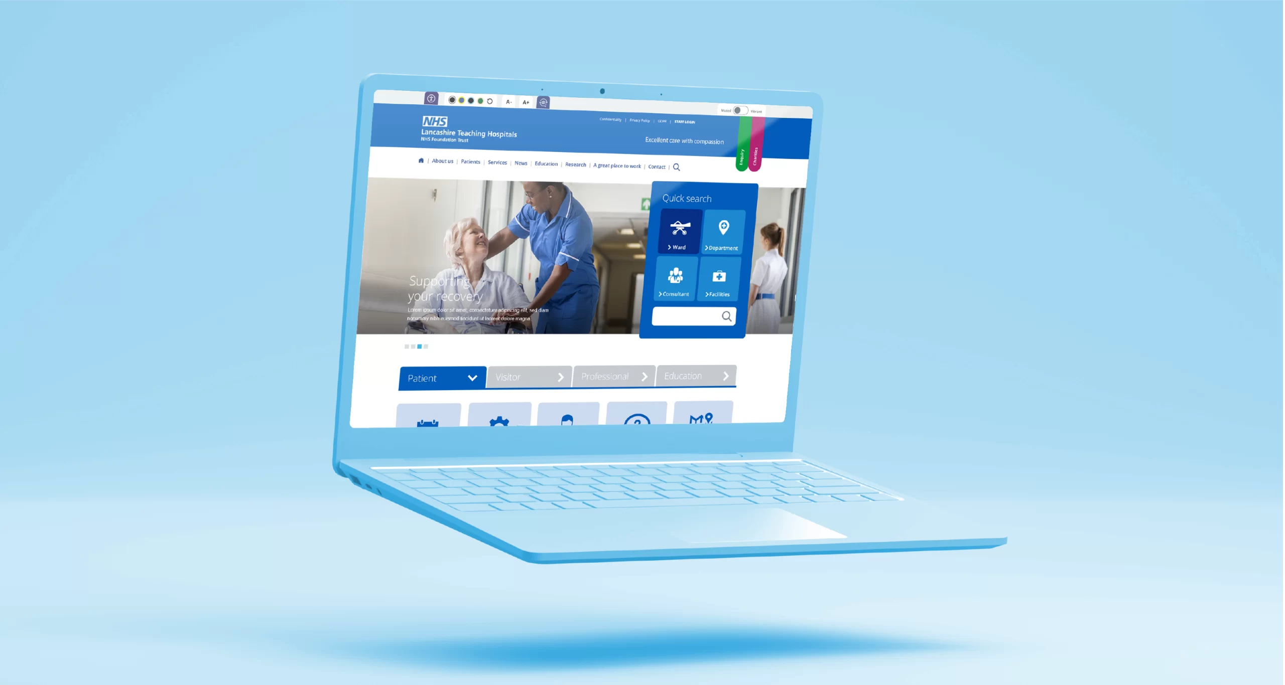
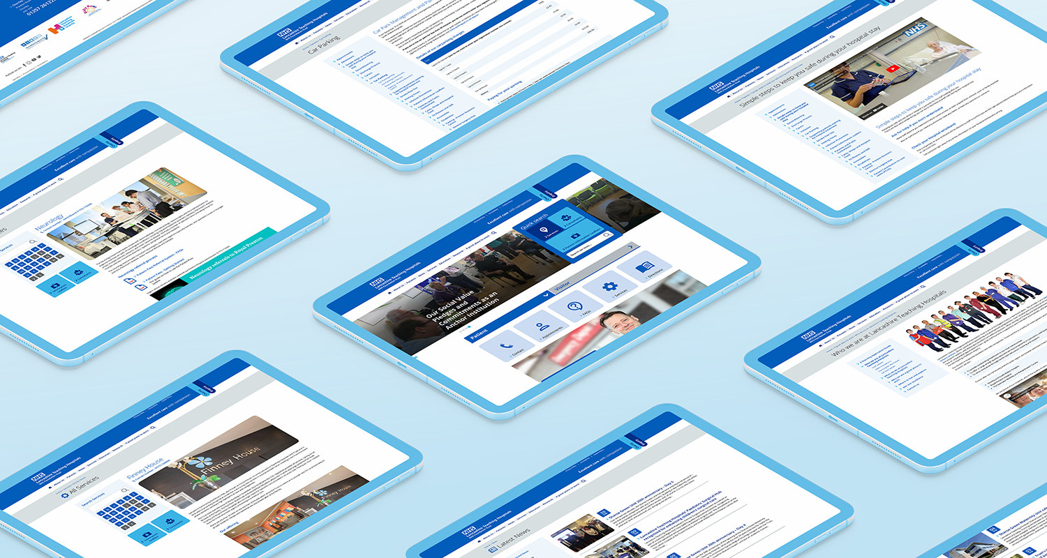
Lancashire Teaching Hospitals, one of the largest acute trusts in the UK, provides district general hospital services across Lancashire and South Cumbria. Over time, their website had become cluttered with an excessive number of pages, and existing systems were ineffective in ensuring up-to-date information was being posted. The site also failed to meet accessibility standards. They approached us to create a fully responsive website that would offer clear information to the public, comply with online accessibility regulations, and enhance the user experience.
UX Research
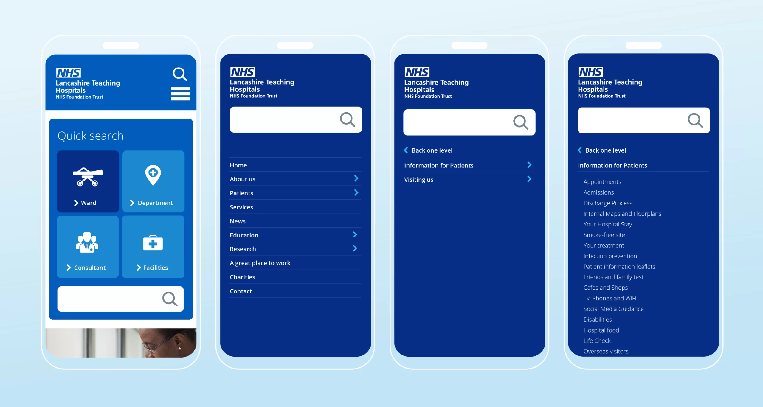
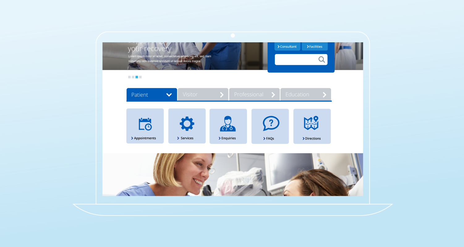
We conducted focus groups to gather feedback on the current website and identify areas for improvement. This involved testing three to four new design concepts, as well as evaluating the existing site. The five sessions included input from patients, local authorities, regulatory bodies, press and media representatives, and the general public.
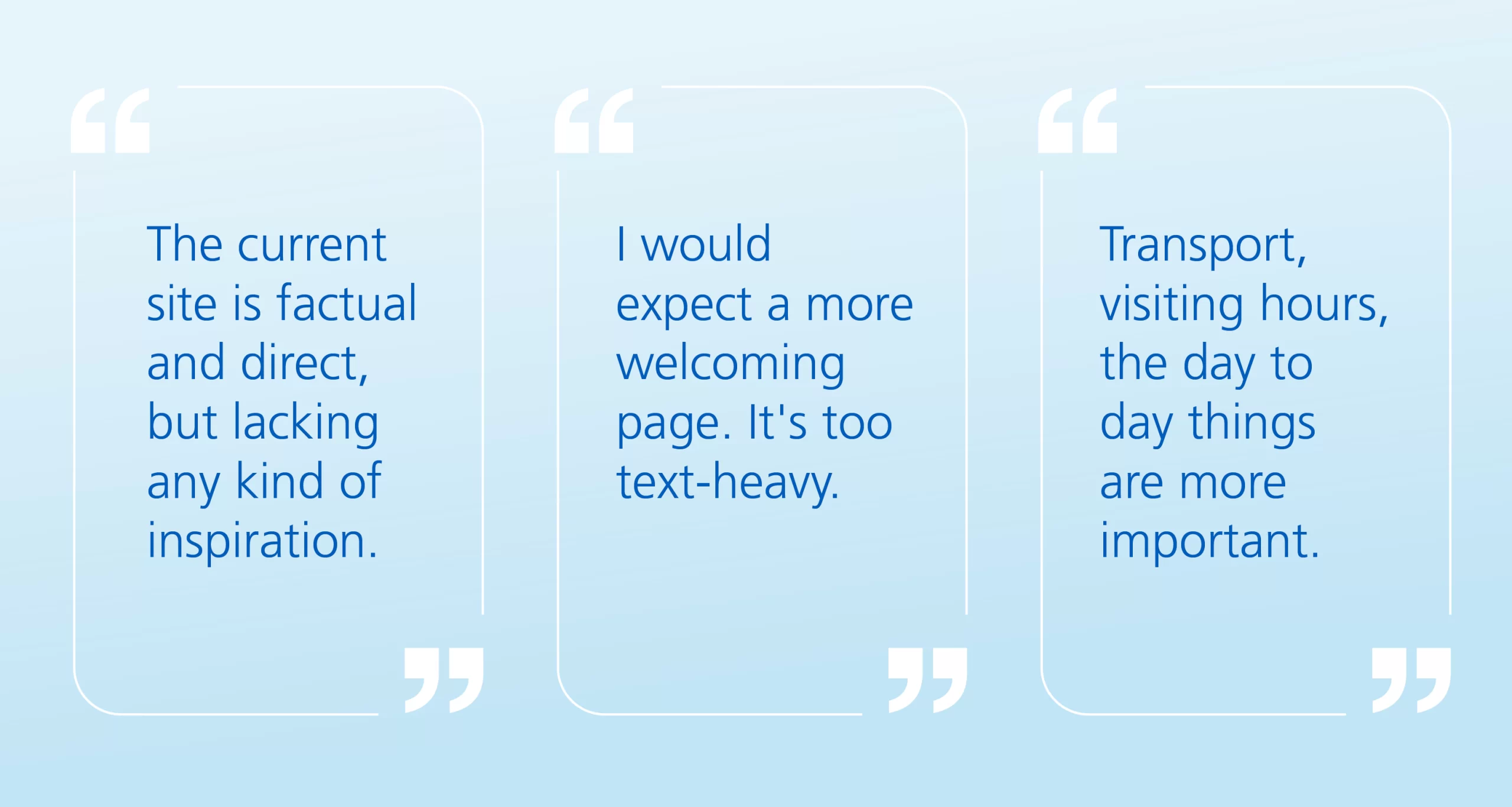
Current site The general consensus was that it was “factual and direct, but lacking inspiration.” One participant commented, “It’s too text-heavy; I’d prefer different colours and icons” another said “Visiting times, outpatient clinics, car park – should take seconds, not minutes to find”. Many agreed that the homepage contained too much information and needed to be simplified, with a stronger focus on the needs of patients.
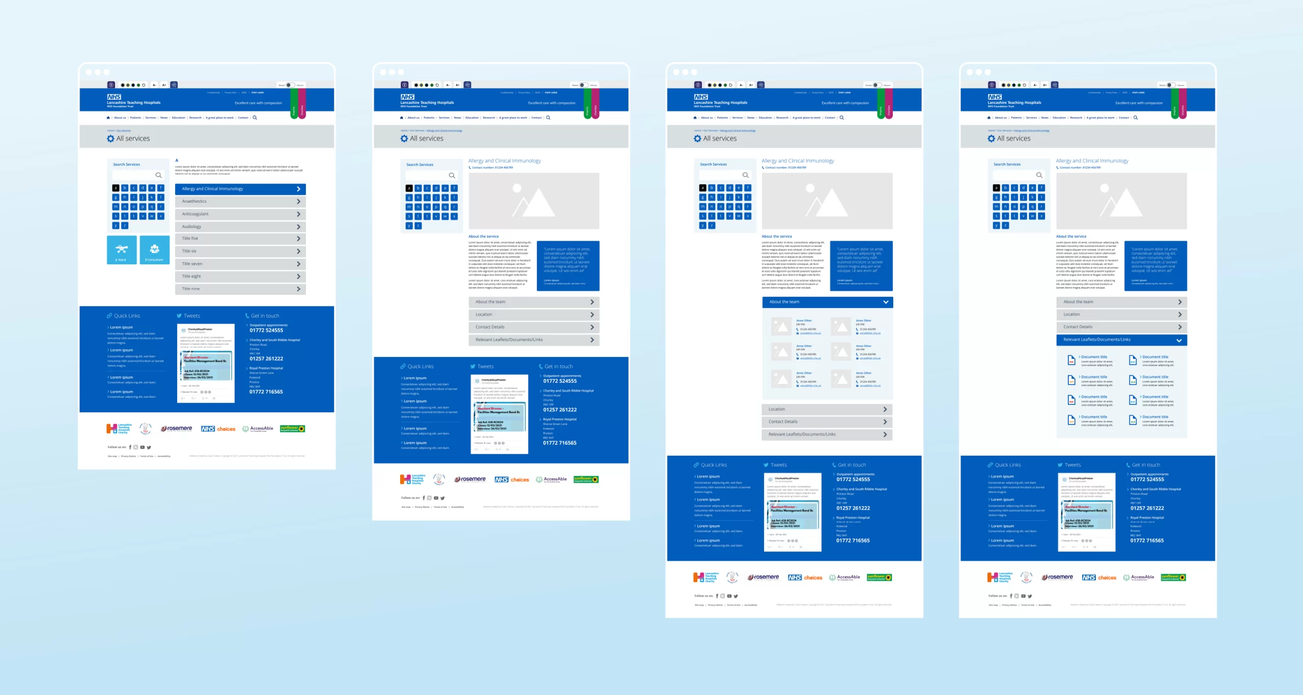
New designs Based on the user feedback from the current site, we developed three new designs and presented them to the focus group participants. Their response was positive, with one noting, “You can access your visit, information, and maps in seconds and the quick search is good” while another mentioned, “It’s clean, with large buttons and icons.” The use of bold highlight colours also resonated with the group, as one participant remarked, “I like the colour blocks; they make more of an impact.”
All work was created whilst employed by Cube Creative.