A successful charity focused on raising more money for a good cause
Brand positioning // Visual identity
The Challenge
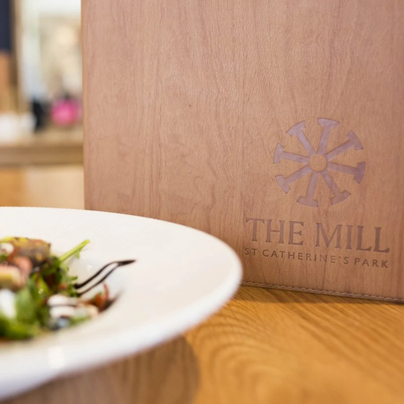
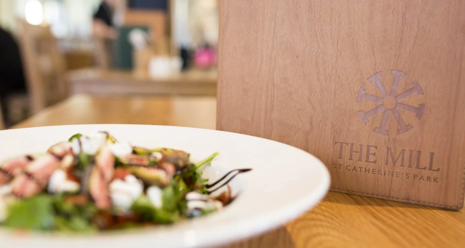
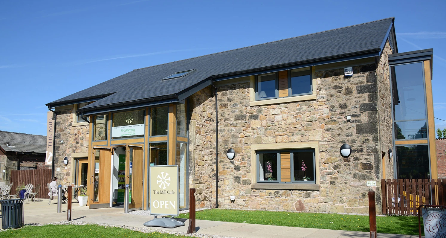
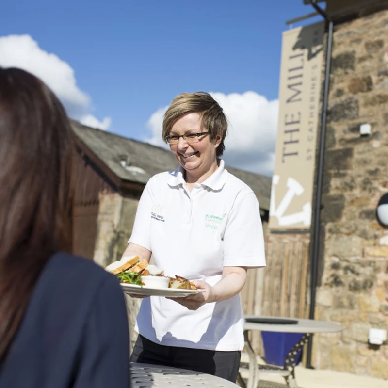
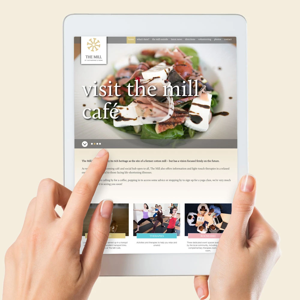
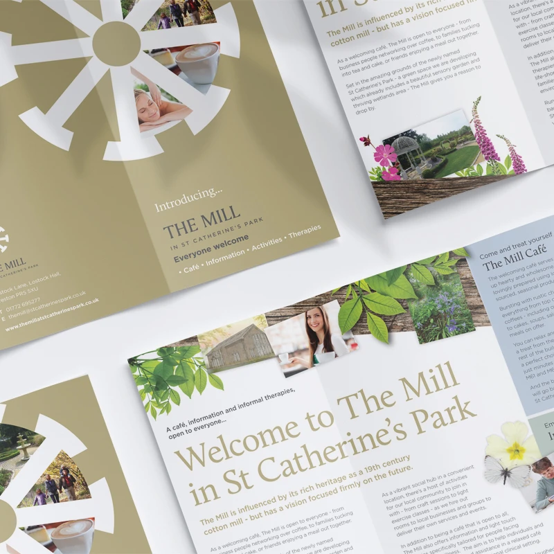
St Catherines Hospice decided to open their surrounding grounds to the public and convert a mill to a cafe, information and therapy centre. This was a revolutionary idea and needed to build a brand which brought together their purpose, to be ‘the central hub of the community’.
The approach
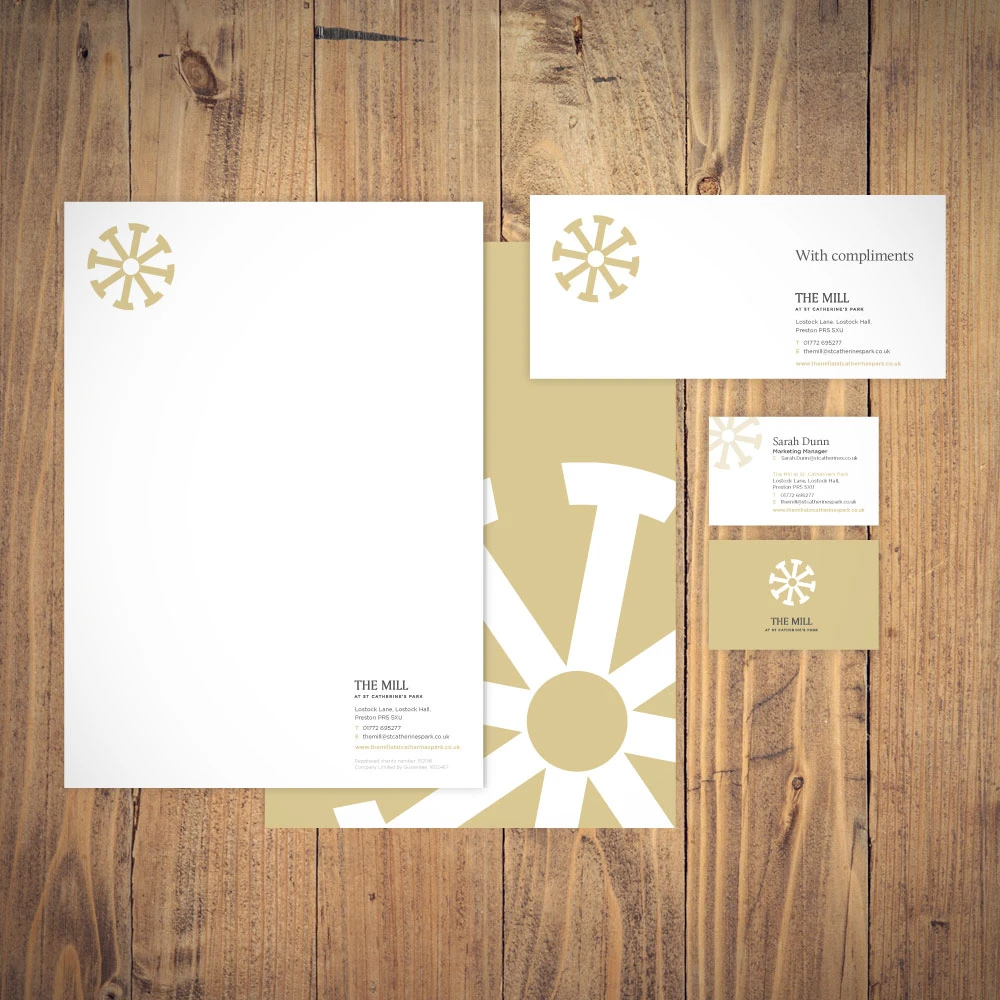
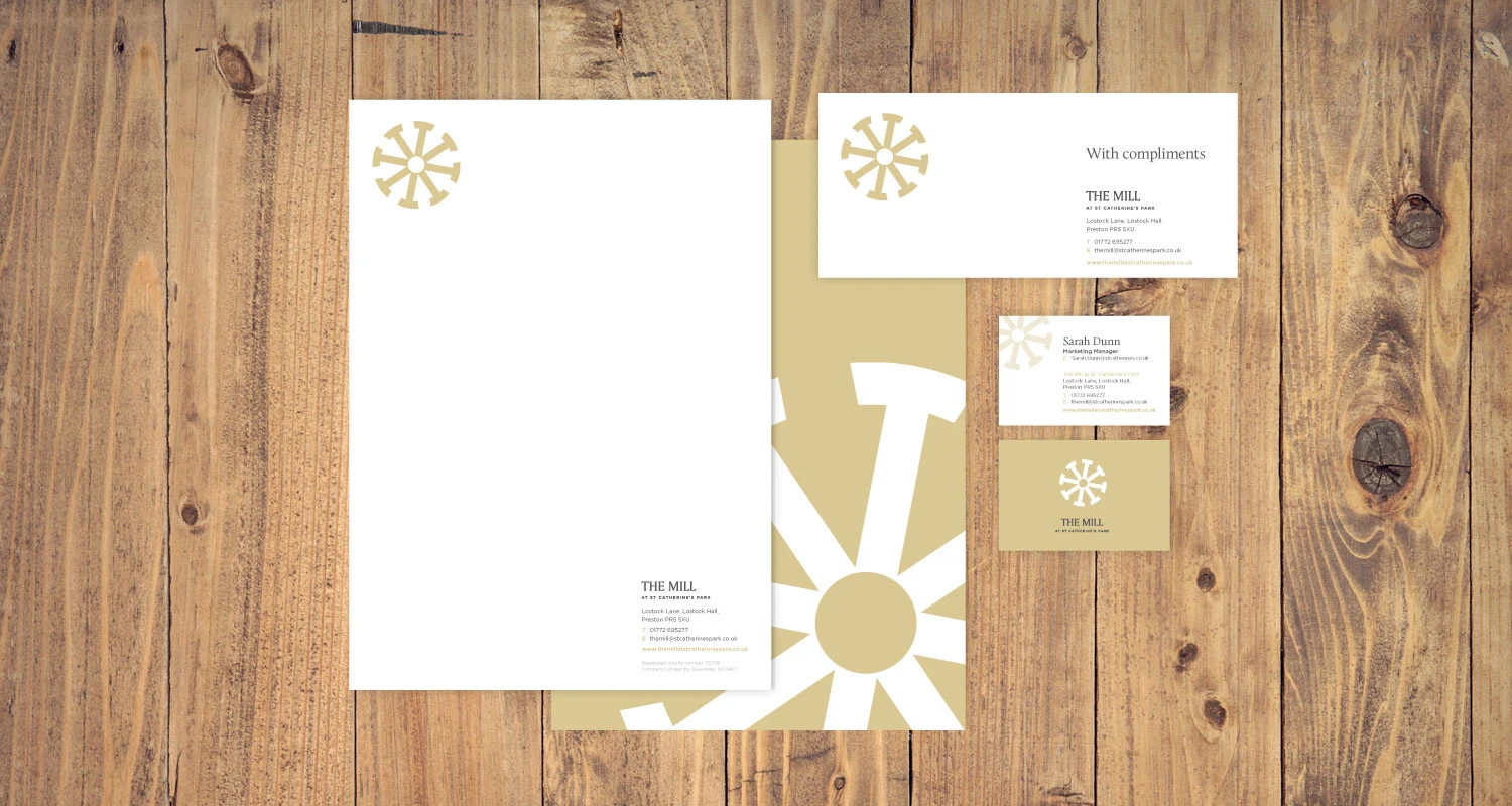
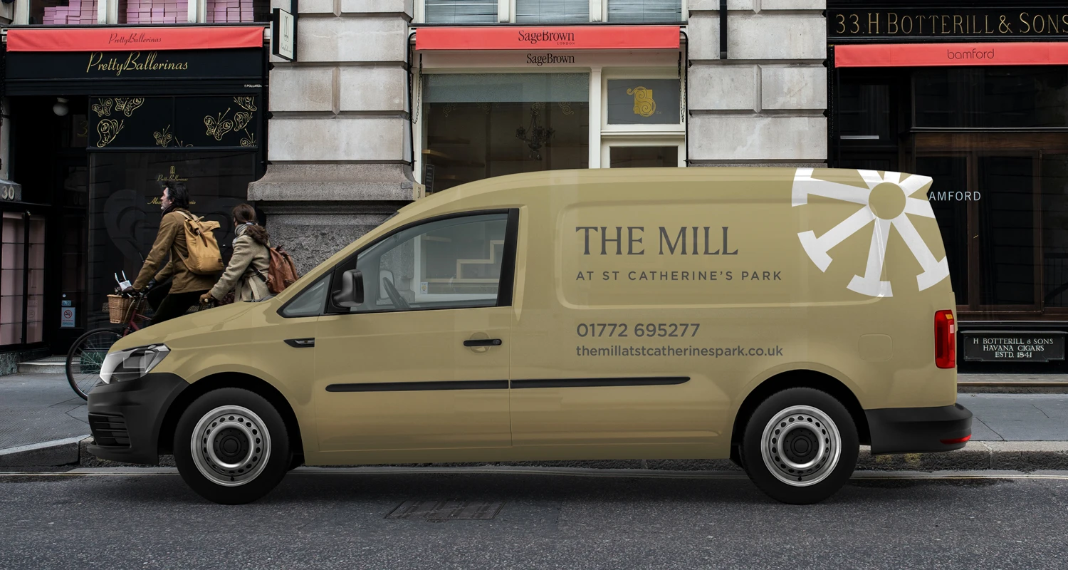
I developed a logo which resembles a mill wheel but carries a more meaningful message. The arrows point inwards with the centre circle representing ‘The Mill’. Instantly recognisable, it creates a strong identity with sophistication and style.
The approach
I developed a logo which resembles a mill wheel but carries a more meaningful message. The arrows point inwards with the centre circle representing ‘The Mill’. Instantly recognisable, it creates a strong identity with sophistication and style.