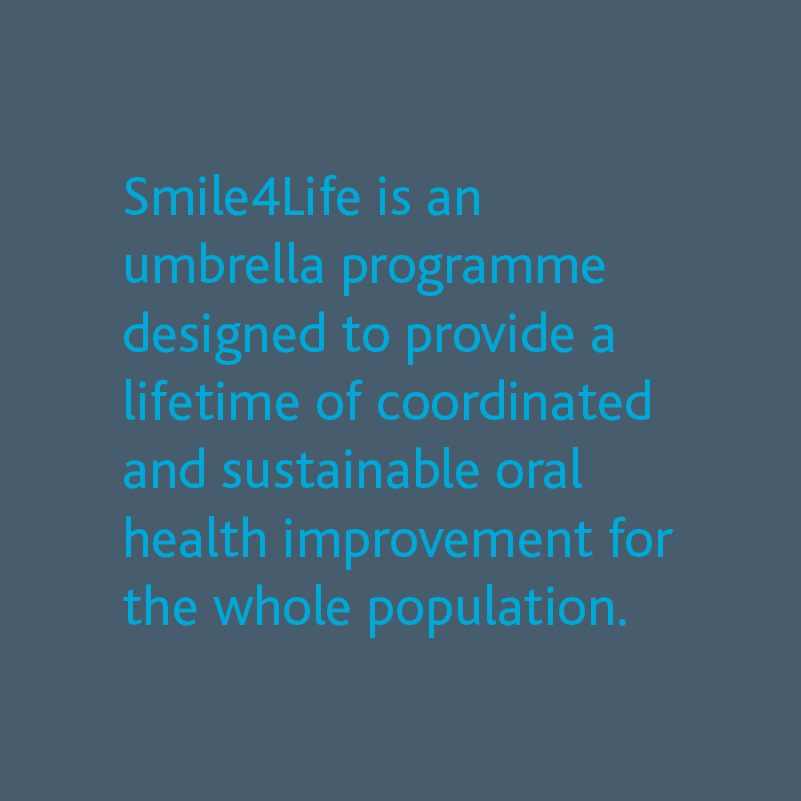
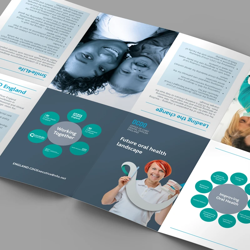
Oral health has improved & continues to do so….but not for everyone. Office of Chief Dental Officer (OCDO) was started to help bridge this gap and provide innovative solutions to commission oral health/dental care and dentistry services. In order to do this they identified they had to improve access to information, support and care. This developed into a simple core purpose “to improve patient outcomes for prevention and early intervention and to support the population in obtaining and sustaining better oral healthcare through life”.
The Approach
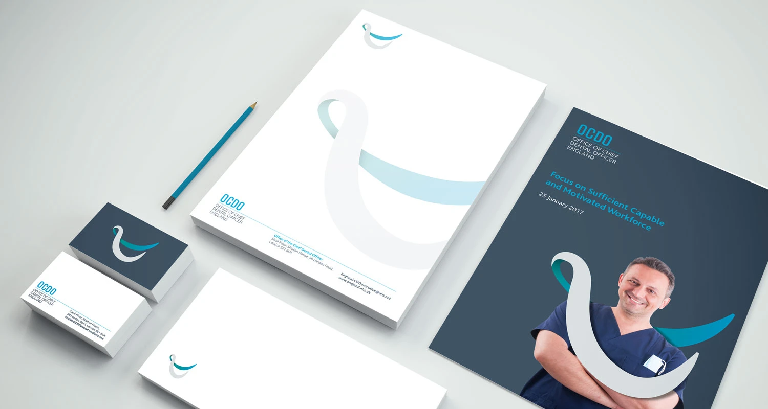
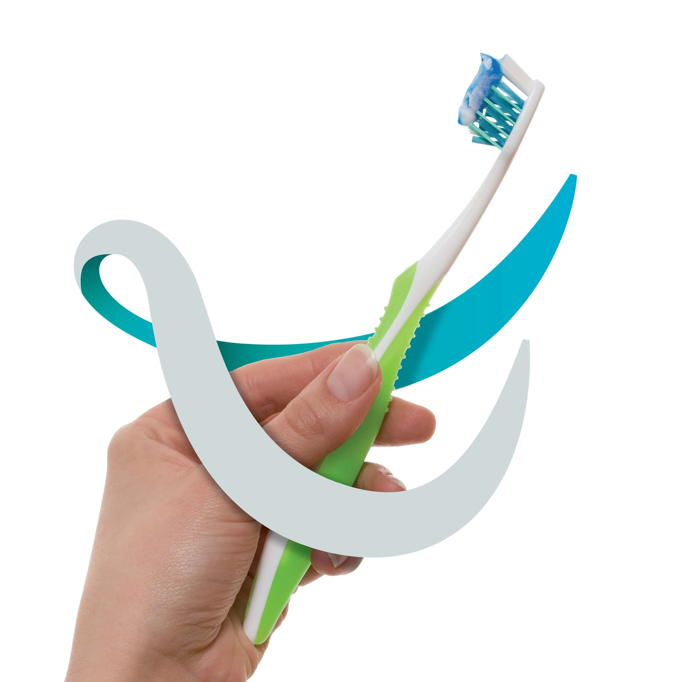
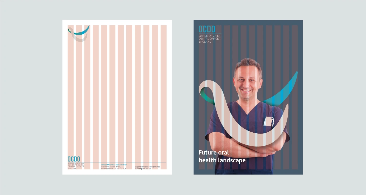
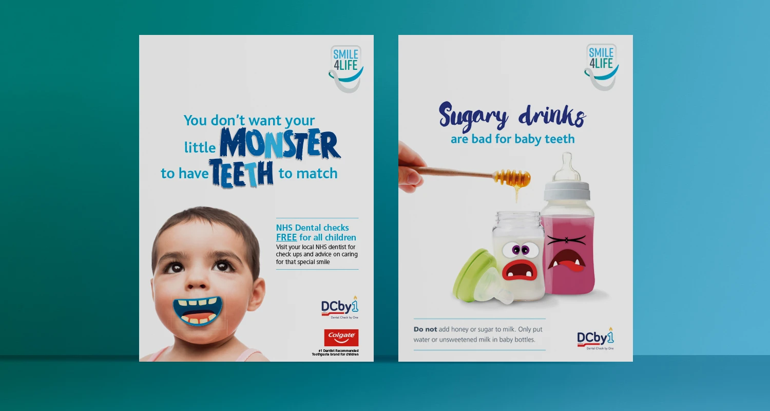
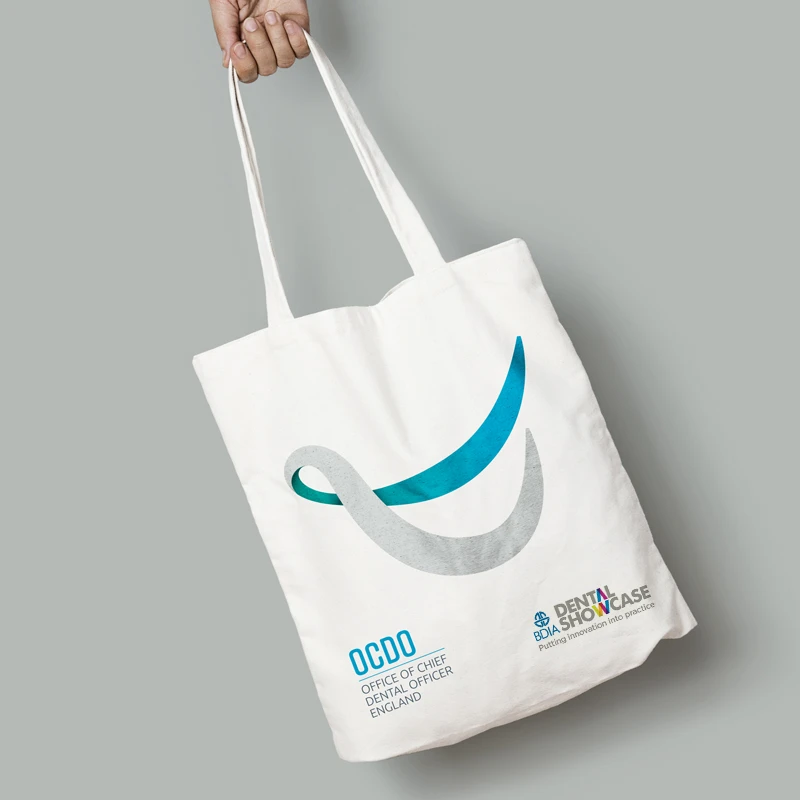
The agency was commissioned by OCDO to create a new logo and visual style which would reflect the importance of oral healthcare. This logo had to represent the mouth as a whole and not just dental care. A smile is with you for life and indicates someone who is warm and friendly but a smile also it represents a healthy mouth.
This smile allowed a variety of other icons to be created in a similar style. It created an easily recognisable icon and, when coupled together with imagery, made strong a visual style. The feedback which the client has been receiving from colleagues and partners has been extremely positive and have now commissioned Cube to create national campaigns to promote oral hygeine.
Jo Murphy
Strategy & Policy Support to the CDO
A highly recognisable brand identity
"Despite strict guidelines around fonts and colours, Richard’s ability to interpret our needs enabled us to develop a clear and highly recognisable brand identity."
If you’re working on a campaign, refreshing your brand, or looking for communications design support, I’d love to hear from you. Get in touch to start a conversation about creating design that informs, inspires and drives change.