A powerful visual approach to help in childbirth decisions
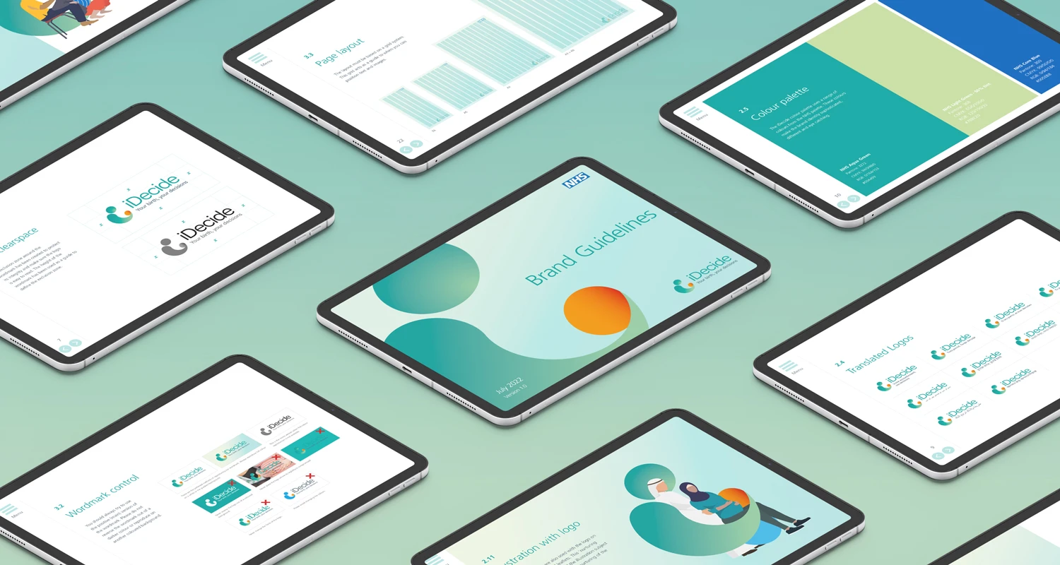
NHS England iDecide Branding and visual identity
A powerful visual approach to help in childbirth decisions
The Challenge
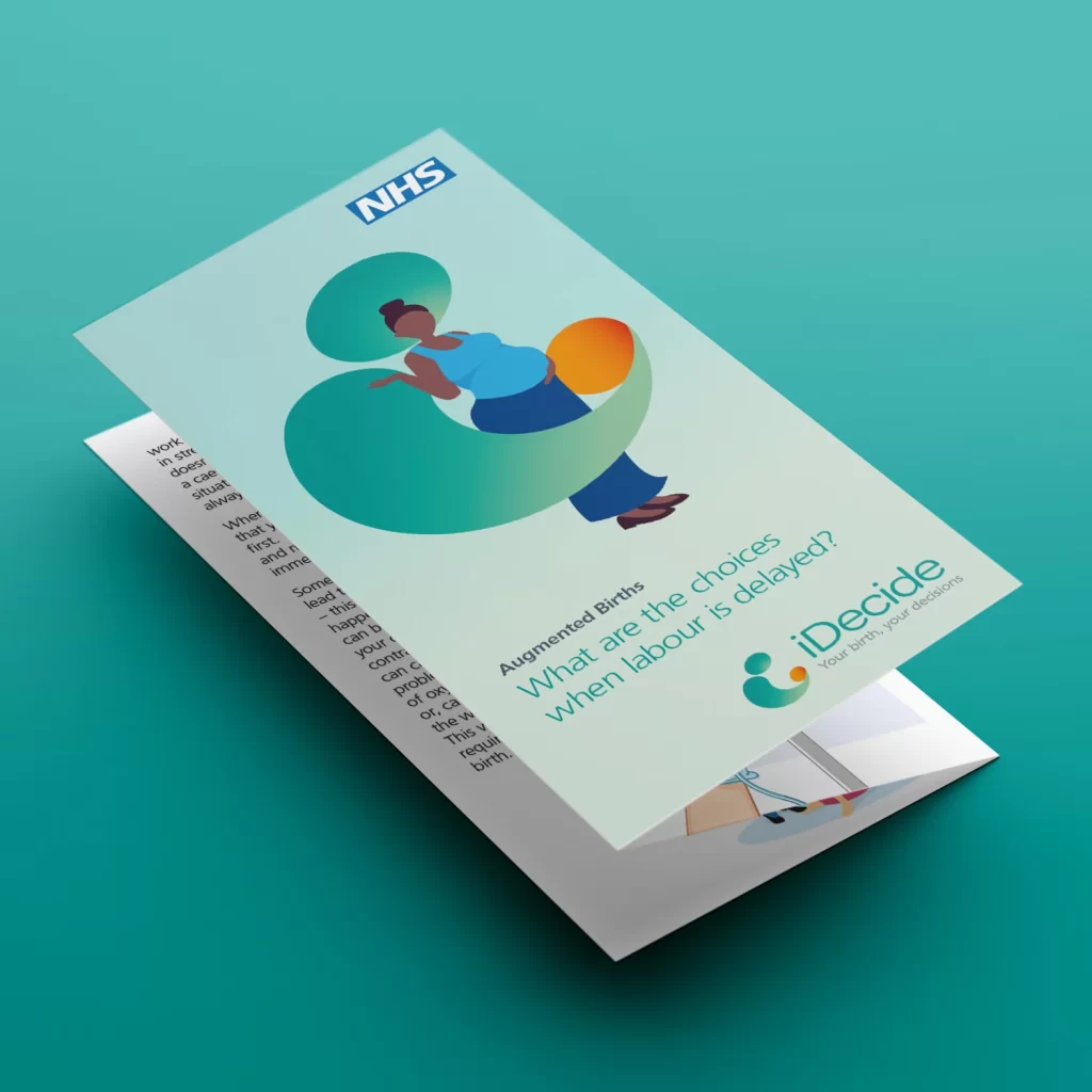
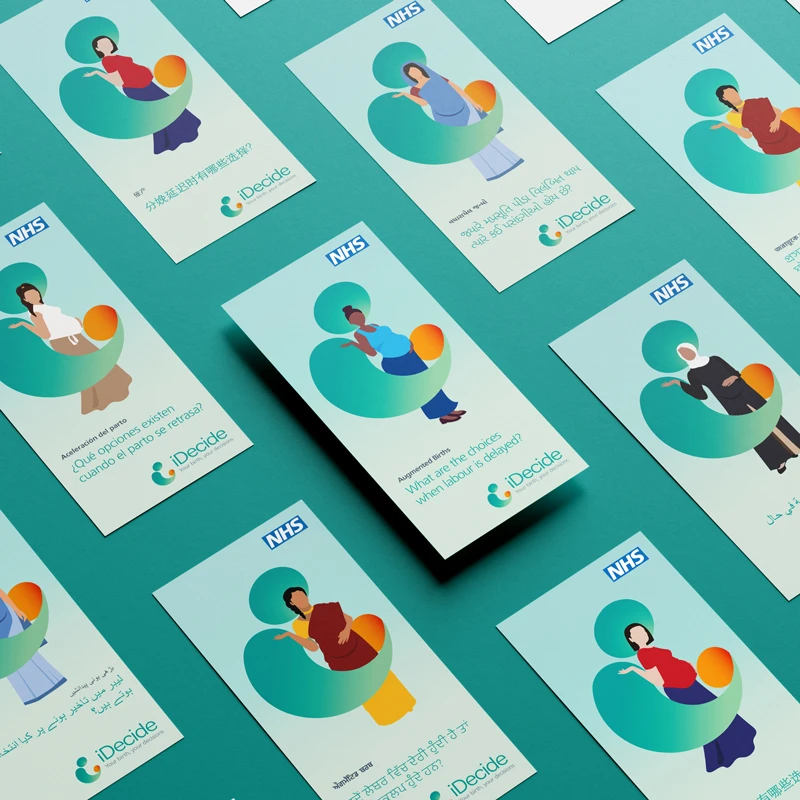
iDecide was developed by NHS England & Improvement. Its aim is to help staff improve communication through informed decision-making and consent during labour. We were asked to deliver a visual identity and communication materials for the toolkit. The visual approach of the materials would help people feel informed, cared for and empowered to make decisions about their care. In addition to the visual approach we also needed the designs to be diverse enough to embrace a range of cultural differences.
The approach
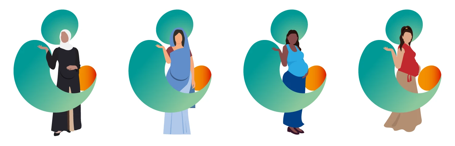
Firstly we put together a co-production group consisting of pregnant women, their partners and renowned maternity professionals from within the NHS and private sectors. The feedback given by these groups provided valuable insight into the direction of the creative. As a result, calming greens was the preferred choice of colour whilst illustrations could be adapted to be more realistic of the scenarios being portrayed and to be more sympathetic to the culture/faith of its target audience.
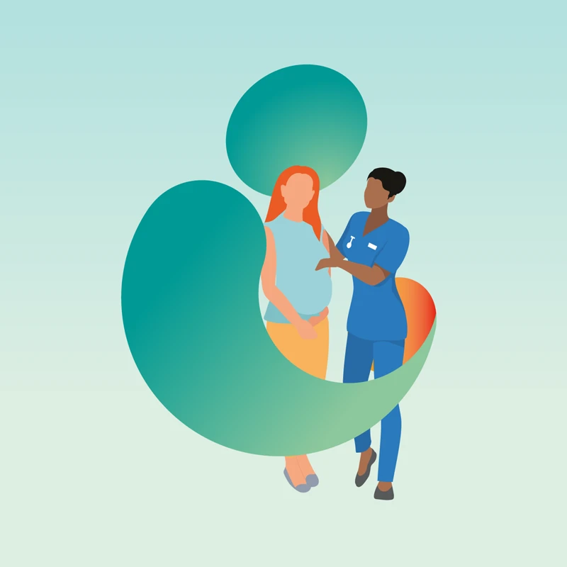
The stylised ‘I’ represents the first letter of ‘iDecide’, supported by the subliminal message of a birthing person holding their child. Undoubtedly this logo, out of the three shown, was the preferred choice as it was visually attractive and non-binary. As we developed the brand this logo would also become a holding device which wrapped around the illustration, highlighting how important care, support and nurturing is to those people about to give birth.